Shortlisted
I entered a data visualization competition with the World Government Summit and Information is Beautiful in January this year. My entry got shortlisted and featured on information is beautiful. I was pretty happy with the outcome because I had really limited time for personal work that month.
The Prompt
The context required using their provided datasets as the foundation and inspiration. There were many topics, including sustainability, energy, health, quality of life, and happiness score. I picked education because it was a subject I cared about. This topic reminded me of my travels where I learned how education access differed between countries - a lot of factors included the country’s wealth, culture, and history.
My Visual Design Choices
My usual process was doodling on paper and Illustrator some rough concepts and encodings. However, my final result was far from where I landed with my initial blueprint. I chose a scatterplot because I wanted to summarize the data at a high level and have the ability to drill down into a single datapoint.
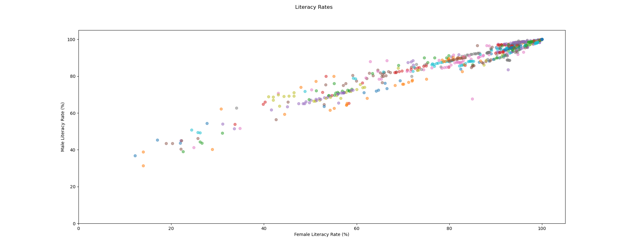
One of the biggest challenges in creating this visualization was spacing. The plot below was created during my data exploration phase. You can see that there are a few points (country and year) loosely distributed on the bottom left, but majority of the points are clustered together tightly on the top right. This forced me to eliminate encodings that looked too “busy” or too detailed (e.g. having petals or fairy wings representing each year). I also switched from a linear scale to a logarithmic scale, which brought the farther datapoints closer and the closer datapoints farther.
Unlike the chart below, I switched the y-axis from Male Literacy Rate to Gap in Literacy Rate (Male Literacy Rate - Female Literacy Rate) in my final design. I felt like I could show this from a slightly more feminist point of view, pointing out that any datapoint above the y-axis meant that males had a higher literacy rate than females.
Below are some of my iterations with encodings and how I layered the next step. The top left screenshot was just me managing to get the data to render with D3 before adding anything else. Once I confirmed that the data rendered correctly, I proceeded with adding the regions (looks like hills) and years (looks like fairy wings which I removed later) in the top middle screenshot. The top right screenshot is what it looks like after I got the math and code right on drawing hills with multiple outlines.
The bottom row includes my iterations on adding links between each country (datapoint) and region (hill). I really liked the screenshot that is second to the left because it was created incorrectly yet was very pretty when showing the opaque shapes against a black background.
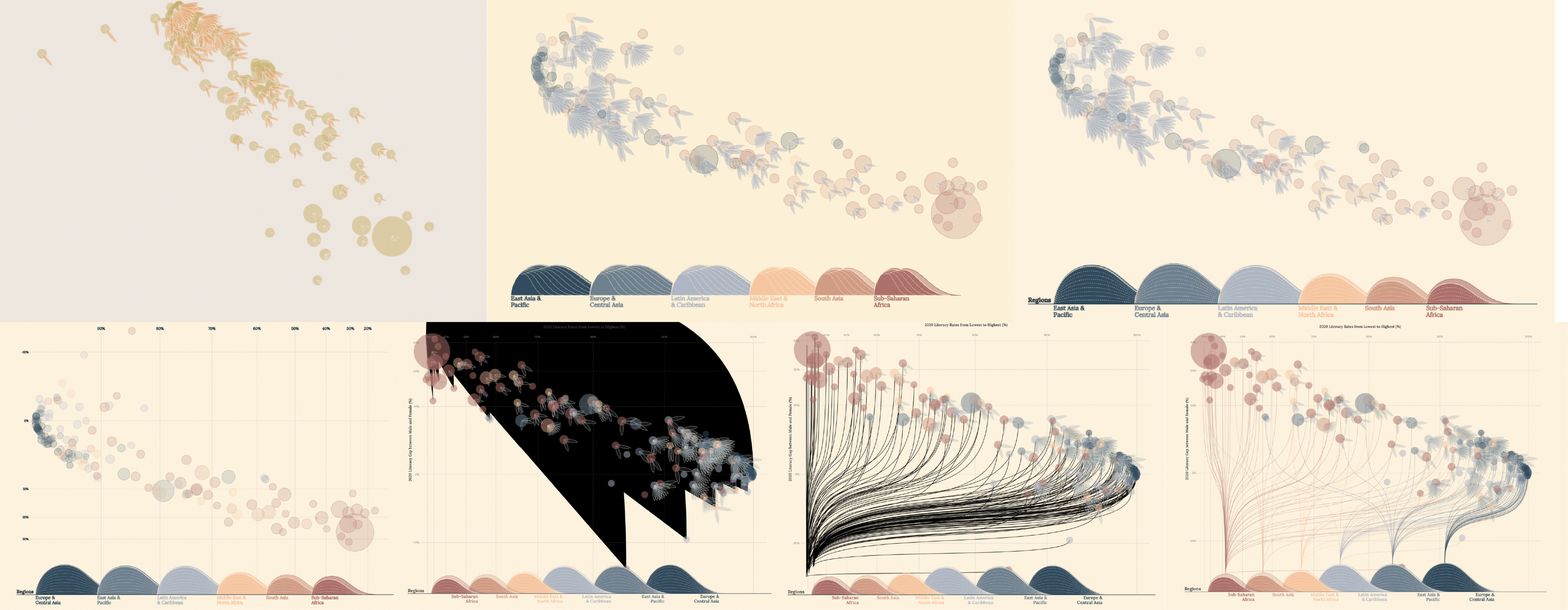
After I successfully added the links with bezier curves, I noticed that drawing links for every country looked too busy. I needed to switch to a summary statistic. Initially, I wanted to highlight the mean and draw a dotted radius around the first, second, and third standard deviation to indicate what was in a 68-95-99.7 percent range. However, that was incorrect because my data was not normally distributed. My alternative was to draw a point for the mean and another for the median, which would illustrate how skewed the data could be.
Finally, I asked my friend for feedback in my finished draft, which led me to add interactions using scrollama. The legend was about equal size as the chart itself, and it was rough on the reader to either get overwhelmed by the legend first or the chart first. With scrollytelling, I was able to break up the story into layers and introduce each step one at a time.
Looking back, there would have been a few design choices that I would have re-evaluated if I had more time:
- Responsiveness: My website was not responsive because my chart had a fixed width and height. This would significantly discourage the user experience, although I hoped that my scale would have captured the majority of readers.
- Medium: Although I went with the web/interactive route, I could have done this in print because the legend was that huge. With web, a user can see limited things on the screen without scrolling up and down, but with print, I could have laid out different charts, texts, and images in any direction. Plus, I designed the legend in Illustrator and had a lot of fun with the layout.
- Interaction: The only interaction I added was hovering, which would make the other datapoints more transparent. I could have explored showing more information upon hovering over a particular country/region, applying filters to clean up the chart, or adding a search bar to find a particular country.