It’s the Season Again!
This vibrant Sugarfina ad in my inbox caught my eye, and I was so excited to find out they were promoting for Chinese New Year. Their packaging sparks so much joy! 🥲 Kudos to their design team. Their red and yellow color palette inspired me to create my own Chinese New Year design.

Finding the 成語 Data and Design
The toughest part of this project was finding available data related to Chinese New Year. Initially, I wanted to draw the Chinese zodiac, including each animal’s traits and compatibility, but soon found out that they were symmetrical. My second option was to draw an intense migration visual similar to what Baidu (the ultimate tracker in China) has published for Spring Festival. However, I never found travel data anywhere.
After a full week of tossing ideas around, I finally thought of creating a visual on Chinese phrases, which are called chéng yǔ (成語). Chengyus are expressions that are commonly made up of 4 characters, and they can be very difficult to understand even for the native speaker (which I am not – double whammy).
To show you how hard Chengyus are if you haven’t heard of them, here are some of my favorites from good old Chinese school. 🙃
- 雞飛狗跳 - Chaos (literally means chicken fly dog jump)
- 大排長龍 - Long line (literally means big line long dragon)
- 人山人海 - A lot of people (literally means people mountain people sea)
- 七嘴八舌 - Everyone talking at the same time (literally means seven mouths eight tongues)
There are so many more, some easier to understand and others seemingly impossible. While sometimes frustrating to learn, they do make the language more colorful. Fortunately, everyone says the same common phrases to greet each other during Chinese New Year, so I was able to find the data I needed by Googling “Chinese New Year Greetings” and finding my sources from here, here, and here.
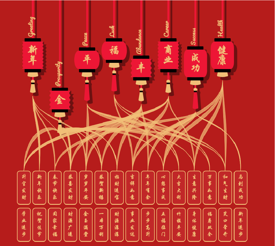
I manually curated a list of 30 Chinese phrases and came up with the idea of grouping phrases based on a motif or type of wish. Overall, most of the phrases had to do with wishing for more money and had characters like gold (金) and fortune (發財). However, in my experience, the majority of people at least start conversations with a hello (恭喜).
I uses Jupyter Notebook to manipulate my data from a csv file (downloaded off my Google Sheets) to a JSON. During that process, I explored a Python library called Chinese to see if I can get a good translation of the Chengyu or break it apart into individual translations of every word. This library was probably the best out there (and built off the other ones I found), but the definitions were inconsistent, questionable, and not well organized. I ended up writing my own definition for each phrase.
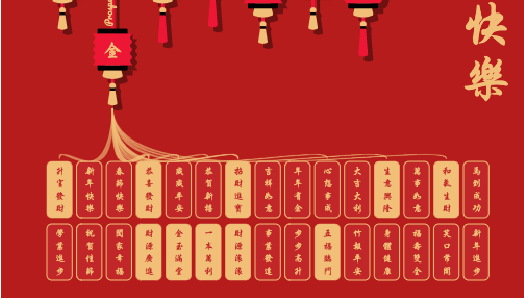
Listing each phrase and grouping them by common themes gave way to the visualization’s network structure. Inspired by the festival lanterns and the color gold, I made each theme a lantern and then made each phrase a golden tile. I also made golden ribbons the links between the lanterns and tiles.
Coding
Lanterns
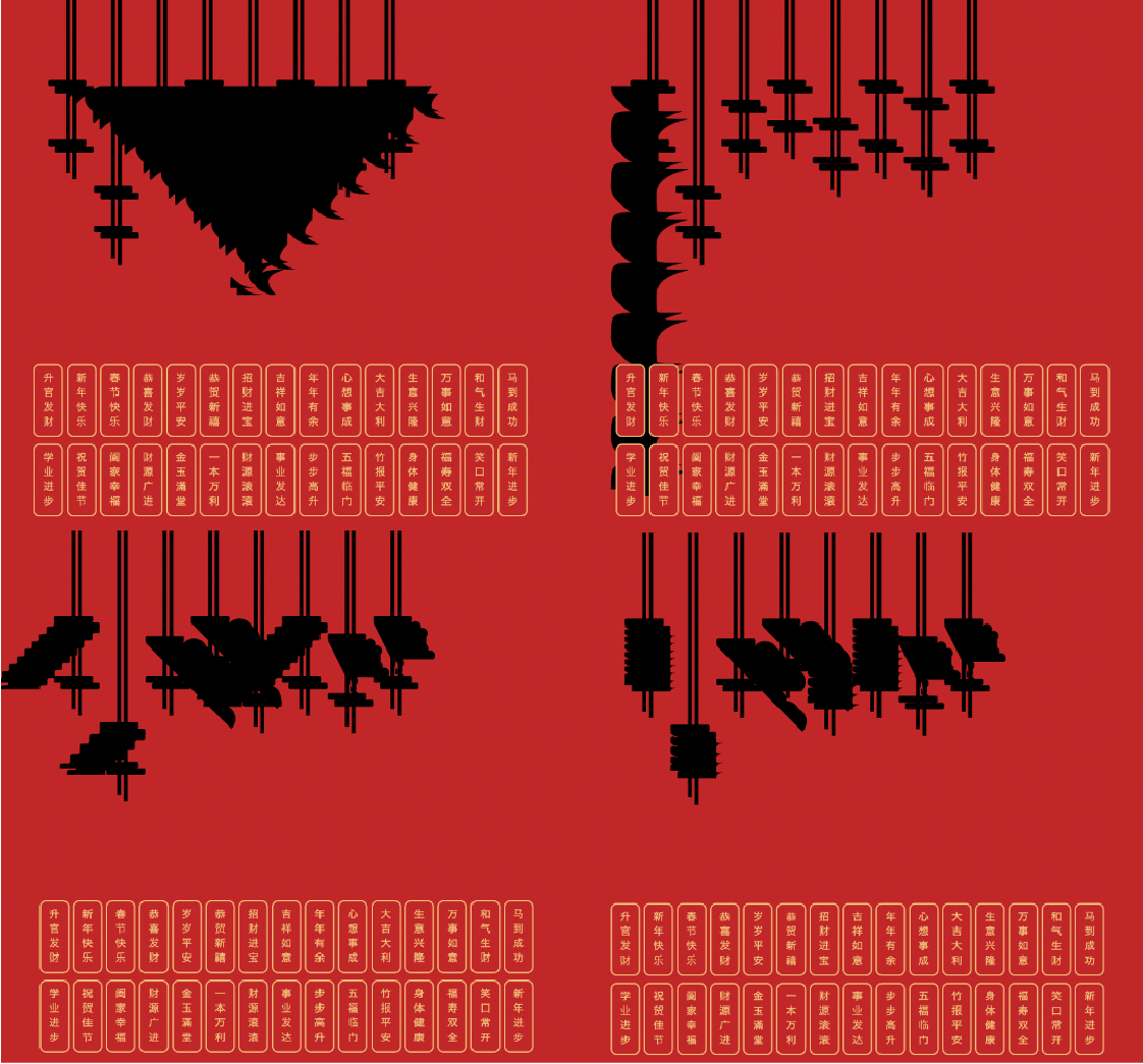
During my coding, I found that this project was more technically annoying than it was technically difficult. I needed to use data to draw different features of the lantern to make it look random enough. I made the number of tiles correspond to the length of each cord, the number of characters correspond to the size of the lantern, the intonation corresponds to the lantern shape and tassel, etc. All of this determined the d attrbute for each path element, which forms a shape.
The first challenge I ran into was creating the shape of the lantern if it needed to have squiggly edges. With no luck finding a shortcut to draw a wavy line, I wrote my own code block that would keep joining semi-circles with alternating faces.
let path = []; // create an Array
let forward = (direction === "down" ? 1 : -1); // set sign based on the "direction" variable

let forwardFull = forward * radius, // define a radius
    forwardHalf = forwardFull / 2,
    backwardHalf = -forwardHalf;
let squiggly = [
    `c ${0},${forwardHalf/2} ${backwardHalf/2},${forwardFull} ${backwardHalf},${forwardFull} `,
    `s ${backwardHalf},${forwardFull/2} ${backwardHalf},${forwardFull} `,
    `s ${forwardHalf/2},${forwardFull} ${forwardHalf},${forwardFull} `,
    `s ${forwardHalf},${forwardFull/2} ${forwardHalf},${forwardFull} `,
].join(" ");

for(let i = 0; i < heightOfLantern * 4; i++) {
    path.push(squiggly); // Keep adding a squiggly path to the list until you reach the end
}
It took a lot of brainpower to set the directions correctly for the cubic bezier curves, so here are some of my bloopers now that I’m over it.
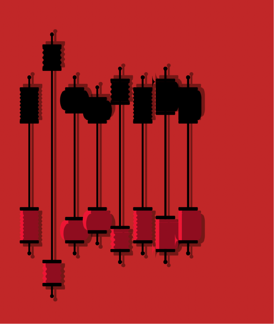
This visual shows my nearly completed lantern shape. At this stage I distinguished the shadow and the actual lantern but layered it incorrectly, giving the bottom image a cool almost-3D effect. I also thought it would be kind of cool to reflect the 2 images, which is why the top is upside-down.
The second challenge I had was drawing the tassel because I wanted to make it round on the bottom. I drew a sample in Adobe Illustrator, exported it as an SVG, and looked at the code. The file used 3 Arcs, which helped me plan out my drawing. Thankfully, I found a helpful online tool to help me write my arc paths.
Tiles
Drawing the tiles was the easiest part. The only nuance I had was orienting my Simplified and Traditional Chinese fonts because they had inconsistent font sizes and offsets. I got my Simplified font from Google but Traditional from elsewhere. Funny enough, the Traditional font I used actually uses Simplified as the input. To make it look more symmetrical when picking between Simplified and Traditional, I added a translate attribute to the Traditional font to shift it left by a few pixels.
Ribbons
In my opinion, creating links that blend with the theme can be pretty creatively challenging. For my graphic, I wanted the links to look vibrant and elegant because they were being emitted from the lanterns. Therefore, I wanted the tips to taper and path to be wavy in order to give the links a flowy feel.
I think the closest type of graph this ended up being is a bump chart, but I used a cubic bezier curve instead of a typical sigmoid function. At this point in the visual, I switched from coding the <path> element’s d attribute to using d3.path, which felt easier to work with (even though it’s pretty much the same).
Here are 2 screenshots of my work in progress for tuning the curve. The first picture’s control point was too high (resulting in a tall-looking set of ribbons), and the second picture’s control point was too low (I overshot it, but it looks really cool).