I entered my first Data Visualization Contest!
The Data Visualization Society published their annual survey data regarding data visualization. Questions included the participants' work experience, tasks, tools, challenges, and demographics. You can find the full information on the survey and challenge of visualizing it here. You can also see my more detailed writeup for the Nightingale here.
In March 2022 (“recently” according to the time I’m writing this), I found out that I receive an award for 3rd place in the explanatory category. I’m super happy that some insanely good judges critiqued my work! It also feels inspiring to see how other people with different skills applied their creativity to the same prompt. Go check out their entries too. o<|:)
Data Exploration
Regardless of entering the explanatory challenge, every visualization starts with exploring the data and drawing out some basic insights. I used pandas and matplotlib in a jupyter notebook to do my data cleaning, processing, and visualizing.
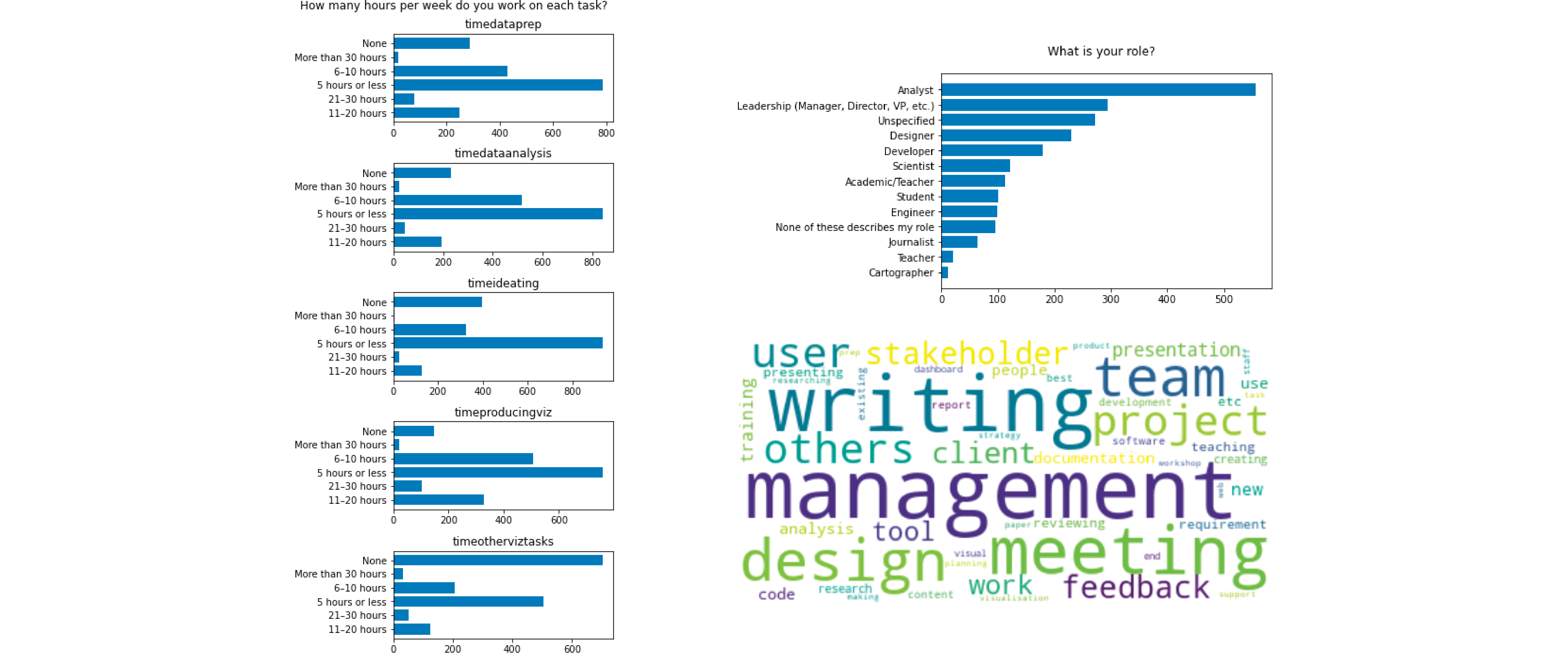
Below are some of my bar charts (quickest chart to make IMO) that didn’t make the cut. I thought the left chart had good potential because it had five distinct and ordered sections, but the distributions weren’t different enough at face value to come up with interesting observations. The top-right chart was similar to the “role” data I used but applied to just employees. The bottom-right word cloud was pretty cool because the majority was comprised of people-related aspects (e.g. management, client, team, others, stakeholder). There were fewer specialized tasks like research, product, paper, and strategy that shows a split between roles. It still didn’t go in my final visualization because I was running out of time to structure and analyze the free-form responses.
After making a few one-dimensional charts, I started creating multiple-dimensional charts to draw deeper insights. I found data that was variable enough for me to visualize, which is how I chose to use employee data. Making sure to include the “explanatory” element, I commented my notes in my notebook, which I included below.
The org sectors are nicely distributed and make a good segment for visualization. The variability between roles within each org sector is informative:

* Most industries except journalism have majority analysts.
* Most orgs have leadership, engineers, and analysts doing DV. Journalism has journalists.
* Public orgs have majority analysts doing data visualization. In private orgs, other roles have to flex into data * visualization as well. IE: In private sector, roles are more flexible.
* In IT, many people who do DV are engineers rather than analysts. Designers have more DV work in IT and private.
* Visualizations in academia is driven by analysts instead of leadership.
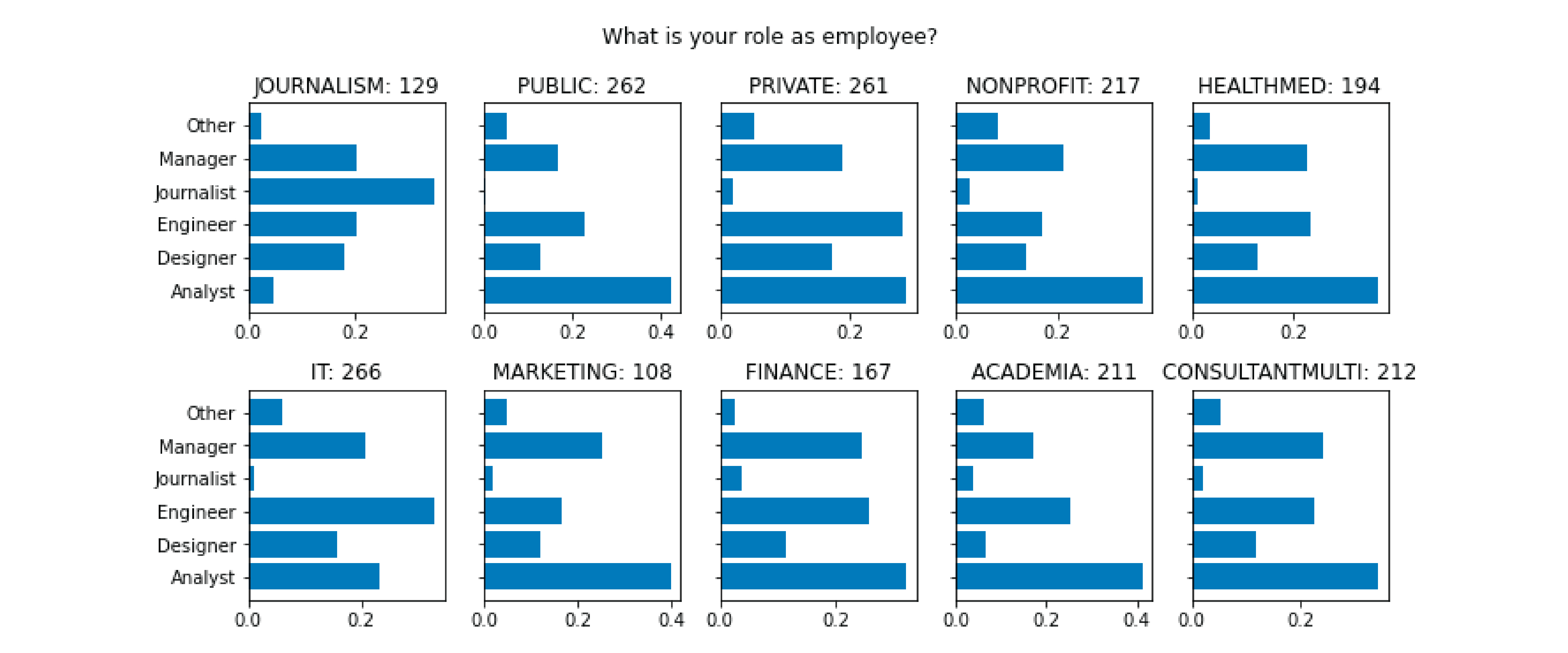
When I finished building charts, I reviewed my observations and picked out the employee dataset as a starting point. I purposely included a mix of discrete segments like roles and continuous metrics like years of experience.
Data Visualization
I spent a few days drawing different chart combinations on paper to come up with an initial design. It was not easy… Actually, it’s always disappointing because whatever I draw on paper never looks good when I put actual data to it. Below was my initial concept that I ended up scrapping because it did not look good in practice. I wanted to make an unconventional chart by making radial ridgelines, which was a bad idea. The distribution was too pointy and sparse.
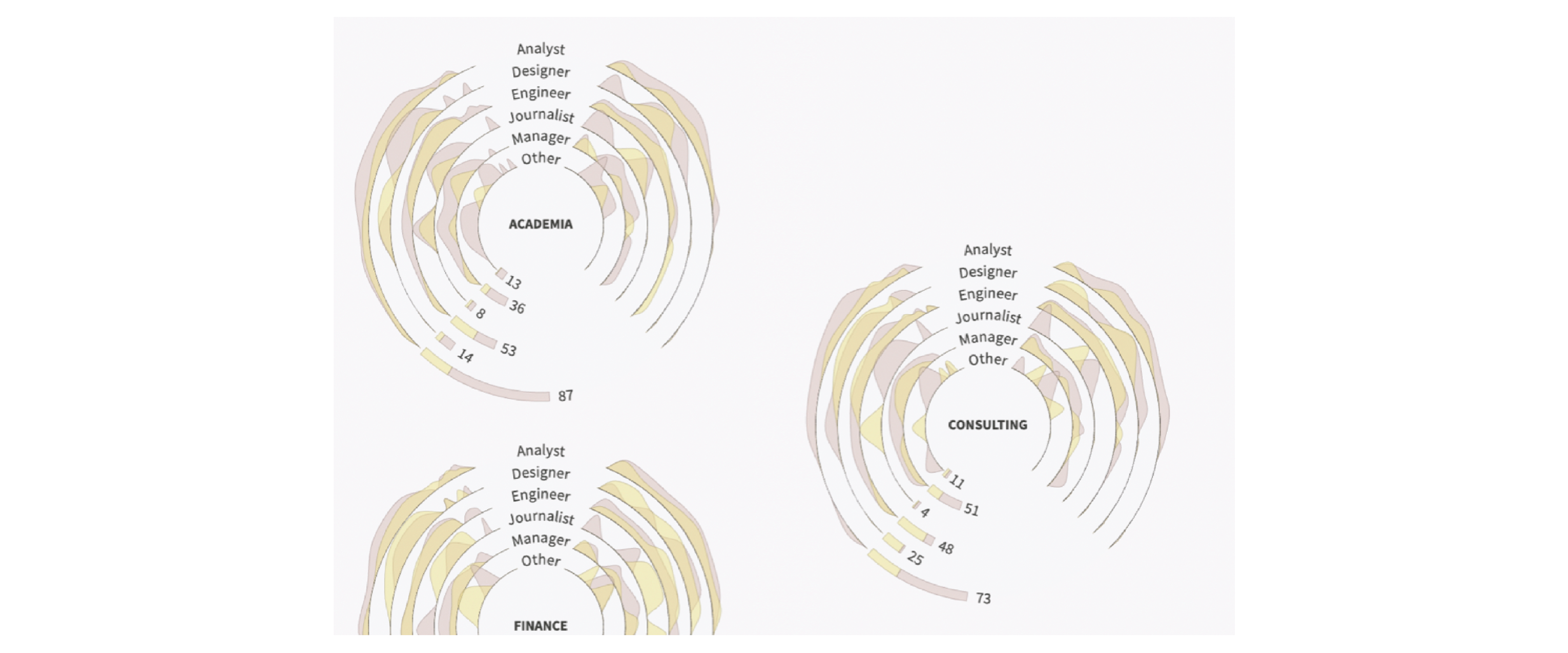
In the end, I completely ditched radial charts. It was overly complicated, and sticking to regular area charts was cleaner. Then I played with color and size to describe the rest of the data. For connecting roles to org sectors (instead of doing a role breakdown for each org sector), I used a sankey to tie them together.
For the data explanations, I thought of using personas, which was how I addressed different questions for multiple stakeholder groups in my dashboard design process at work. For example, if I were designing a sales report, the sales rep cares about how close they are to reaching their monthly goal in their territory while corporate cares about week-over-week overall sales. For the state of the data visualization industry, I saw characters as roles with different attributes: young journalist, analyst in a public company, managers, etc. Since the group sizes varied, it led to the theme of finding similar coworkers.