Inspiration
I started practicing oboe again. Thank you TwoSet Violin 🎻🎻 for making me go practice. While getting back into classical music and trying to be more cultured, I wanted to reexplore music data as my next data project. I had once analyzed Spotify data last year in my previous work where I colored musical flowers based on their chroma feature, so I wanted to take another shot at visualizing music with the same interesting data but in a different way.
Exploring Spotify Data
I could have used the same process mentioned in my previous data gathering with the spotipy library, but I wanted to practice using the python requests library which is used very widely across data engineering for integration work. A lot of help came from reading through spotipy’s source code. You can check out my code in Jupyter Notebook here.
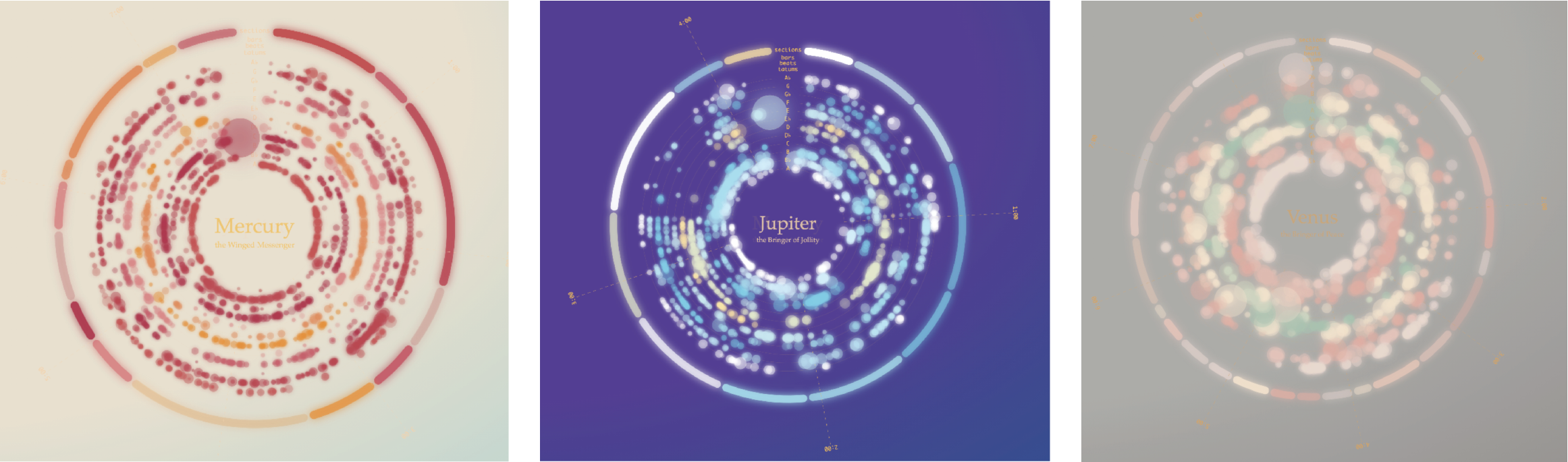
After collecting the dataset for all 7 movements, I did some validations, comparing the data against my musical knowledge and personal orchestra experience playing this symphony. I came to a conclusion that Spotify is not reliable for classical music. The classical genre is structurally and theoretically more complex than mainstream pop, of which the majority uses the same four-chord progression. The metrics, like danceability and energy, used to describe music favors simpler genres or songs that express a single, static emotion. Classic music ranks low in these metrics which make the data look humiliating.
In the charts below, I thought popularity and loudness were the most realistic. Acousticness and instrumentlness should have been 100%. Finally, I don’t think danceability, energy, and valence are good indicators for classical movements that might contain different emotions and evolving ideas.
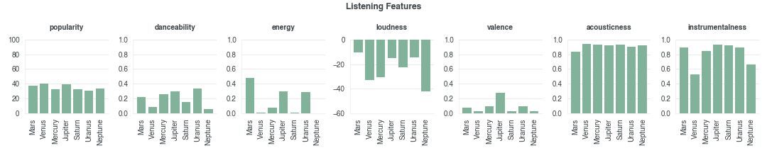
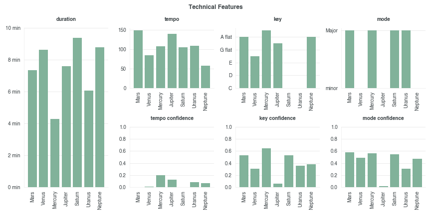
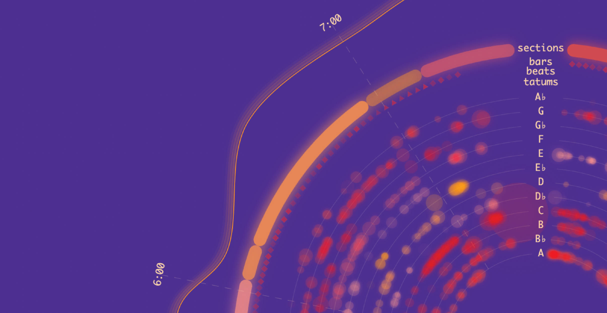
Spotify does provide other data that are more factual. Duration is most reliable metric. Because the pieces have dynamic musical phrases like changing tempo or key, the other metrics are not so useful on the track level. To account for key changes, I used the key signatures from section level data.
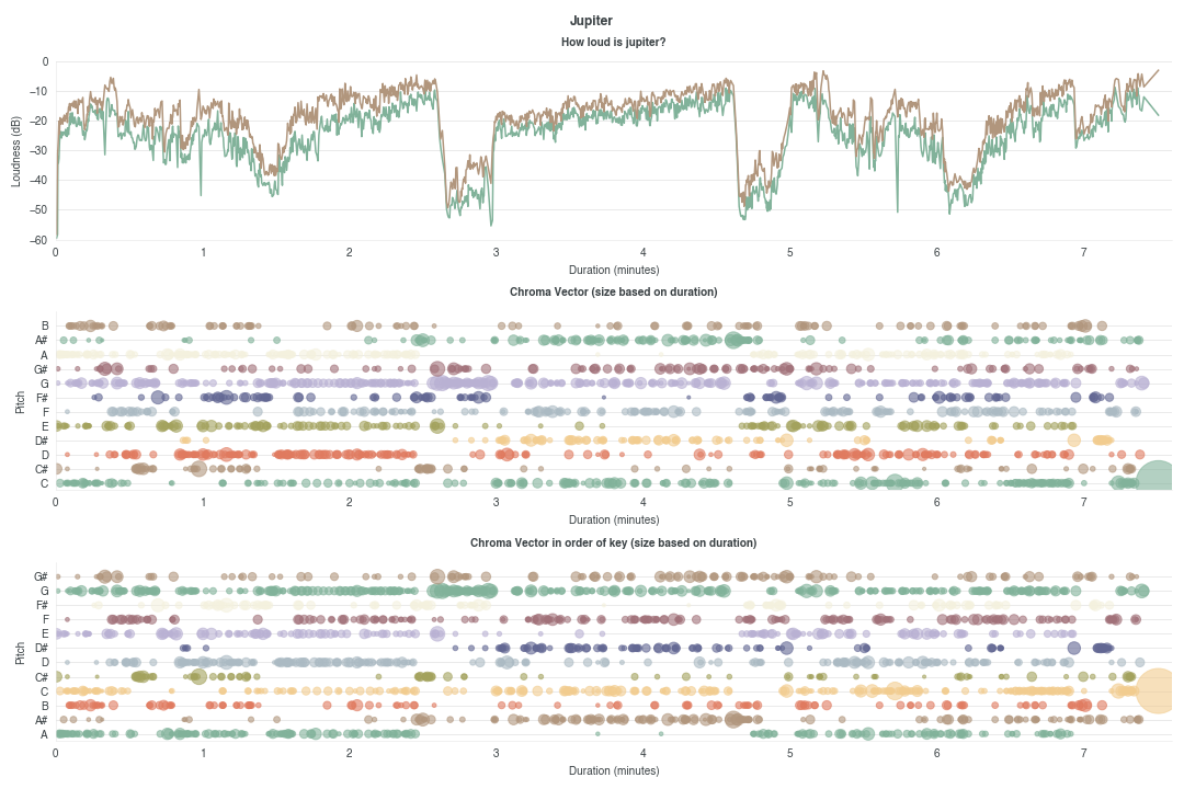
Spotify’s Audio Analysis shows where in the movement gets relatively louder and where different pitches are more prominent. By taking the first key on the section level, the third chart reorders the y-axis such that the tonic (a minor in Jupiter) appears on the bottom. Halfway through the piece, a key change to E-flat is shown in the visual. I was happy with the variety, spacing, and accuracy in the final chart.
Experimenting with Visualization Features
If I had created a static visualization, this entire project would have taken me a week. However, I exploded my scope by exploring 2 features:
Feature 1: Scrollytelling It was my goal this year to experiment with scrollytelling, since it’s been used in a lot of journalism. The New York Times has my favorite example of this concept.
Feature 2: D3.js and Canvas Hybrid
I actually stumbled upon this hybrid approach and didn’t know it existed until I needed it. At first I used only D3.js, but it got very slow when I started using transitions. I was rendering well over 1,000 elements in the DOM. Canvas is more performant for this use case because canvas is a single DOM element. I knew about this performance-hit already but still low-key tried to pull it off with D3.js… obviously, it didn’t work.
I switched to using only Canvas. However, when I started animating, interpolating e v e r y t h i n g and natively keeping track of keys (e.g. the shape for the second note of A-flat in Mercury needs to move the position of the second note of A-flat in Jupiter) was so low-level and so not worth the time. Data binding is D3.js’s specialty, and I needed to find some way to easily implement binding for Canvas.
After searching explicitly for data binding on Canvas on Google, I found this golden article on the hybrid approach. It involves first writing everything in D3.js but replacing the foundational SVG element with a dummy element, which would not render. The second half is writing code for making Canvas render the D3.js objects with this magical code.
d3.select("#elements-created-in-d3").each(function(d) {
  var node = d3.select(this);

  context.fillStyle = node.attr("fillStyle");
  context.rect(node.attr("x"), node.attr("y"), node.attr("size"), node.attr("size"));
  context.fill();

});
Making it Pretty
I spend three hours creating 7 color palettes on Illustrator, which was one of my project highlights. :D After rendering the visual, I did have to make a few tweaks. With this color palette, Mercury was too bright to see anything and Jupiter looked too similar to Mars.
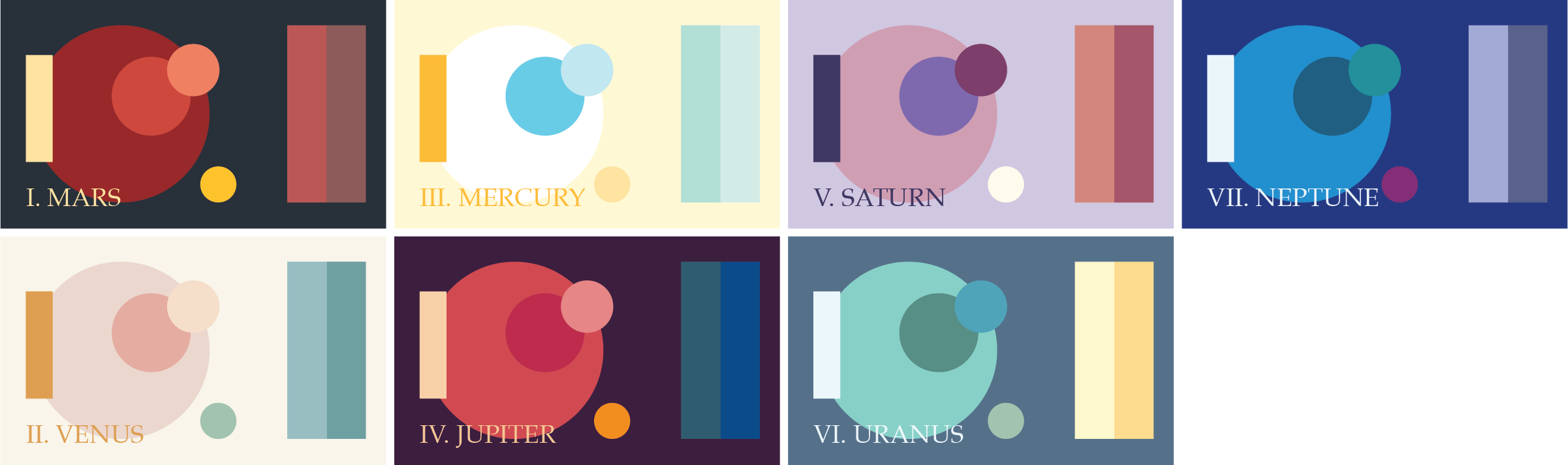
Again, I was really happy picking colors and thought the my bloopers in mixing up palettes turned out pretty nice.
While most of the visual was straightfoward using circles, arcs, and radial areas in D3.js, one performance challenge I had was using filters. I learned that even Canvas renders filters very slowly. This means that for animation, both D3.js and Canvas are not performant when applying any sort of filter. Fingers crossed that I’ll eventually find a library that has this capability.
As a substitute for the glow or gradient filter, I found a hack for drawing the same shape with decreasing size but increasing opacity. If you look closely at the loudness meter (the outermost line), you’ll see discrete layers that achive the glow effect. I thought that was so cool!
Why is this Part I?
After redoing my project two times (from D3.js to Canvas to hybrid), I wanted to take a mental pause and switch contexts. There are a few things I feel like this work is lacking some detail and there are some more things I wanted to experiment with later on.
- I want to add more supporting visuals that affect the main visual. For example, when I read about the 5/4 time signature in Mars, I want to explicitly point to the pentagon shapes (bars) and highlight the sections where the 5-beat pattern is present. Without these detailed visual explanations, some music theory knowledge might be required to interpret my visual.
- I want to add visuals that compare tracks against each other, such as comparing duration and popularity for all 7 planets.
- Similar to my Spotify Flowers project where I built a template for any song, I wanted to either extend this as a template or try some fancy web playback or audio interaction.