From November 3 to November 6, 2020
It felt like the whole world was watching the live updates on the U.S. Election. I started seeing so many impressive data visualizations sprout up that I wanted to contribute with my own infographic.
I got my data source from the MIT Election Lab, which provided presidential election data from 1976 to 2016, and Britannica, which provided the latest table of U.S. electoral votes by state.
Assumptions
I had to refresh my memory on why the electoral college system exists and whether it was still relevant. The electoral college is supposed to reflect the voter population while giving enough weight to the smaller states to make their votes count. I made the following assumptions to simplify my data cleaning (and finding) work:
The number of electoral votes for each state changes with the U.S. census every 10 years. However, I did not find that data that easily and used the latest snapshot, assuming the number of votes never changed historically.
States can decide how to distribute their electoral votes, and all except Maine and Nebraska delegate votes using winner-takes-all. I did not distinctly show how these 2 states split up their votes for each presidential candidate.
Analysis
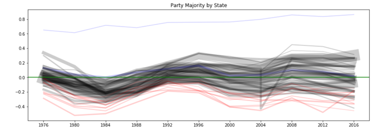
Before coding with D3, I visualize my data using Python’s matplotlib (or any tool that could make charts quickly) to get a sense of the overall shape, complexity, edge cases, and analyses. This chart was a precursor to my vertical circle/line chart (it’s supposed to be 1 line for every state, but I coded it in D3 with a line plot and a scatterplot). I colored the line blue if the state has always been Democrat, red if the state has always been Republican, or black if the state has been on both sides. To my surprise, the majority of states, including California, have all been Republican at some point within the past 40 years. It turns out that no one wanted the Democrat running against Ronald Reagan in 1984.
For this project, I wanted to understand better on how swing states are determined because I haven’t seen any algorithm for it. Online articles like FiveThirtyEight and the New York Times have identified their sets of battleground states, so I used theirs as a baseline.
I identified 3 factors that could make a swing state:
- Democrat and Republican voter percentage are pretty equal.
- State becomes less one-sided (i.e. becomes more equal) over the years. A possible explanation is the new voter generation that increase the number of democrat participation.
- Electoral votes switch between democrat and republican over the last few elections.
The last 2 points were covered in FiveThirtyEight’s swing state analysis pretty well, since the article paid attention to aspects like how the younger generation population identified themselves and changing demographics in particular suburbs.
I mostly focused on the first point because it was the most quantifiable with the state-level data I had. I plotted the difference in percentage between the 2 parties for each state. Believing that states with smaller differences would make them a likely swing state, I plotted a cummulative party variance chart to find a threshold that would capture swing states. The chart below (based on 2012 election results) shows that there could be 14 swing states if the party variance is within 8%.
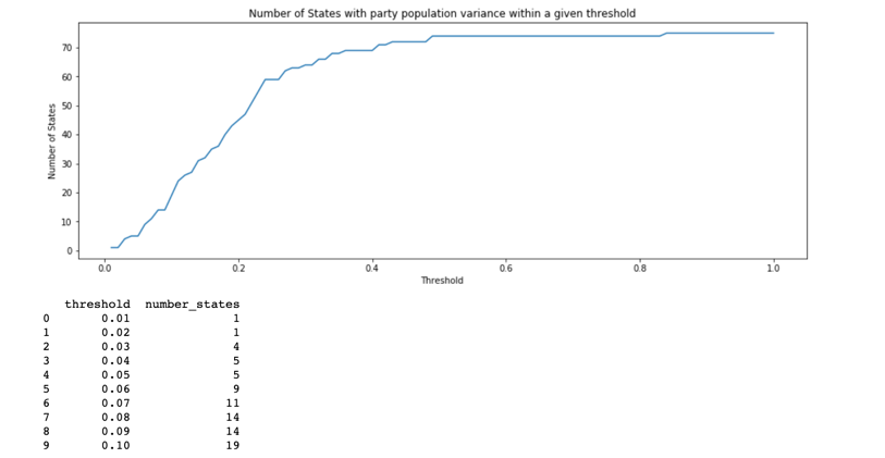
These are the swing states I identified based on party variance from the 2012 election. All states within 8% were claimed to be swing states by many sources. Of the 3 states in the 8-10% threshold, only Arizona was identified as a swing state for 2016. However, both Arizona and Michigan were swing states in the 2020 election.
Voter variance within 0-5%: ['Florida', 'North Carolina', 'Ohio', 'Virginia']
Voter variance within 5-8%: ['Colorado', 'Georgia', 'Georgia', 'Iowa', 'Minnesota', 'Nevada', 'New Hampshire', 'Pennsylvania', 'Wisconsin']
Voter variance within 8-10%: ['Arizona', 'Michigan', 'Missouri']
Visualization
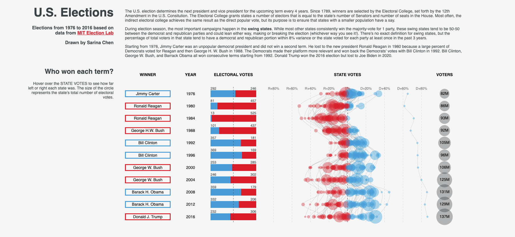
I liked this visualization because I aligned multiple charts to create 1 big chart (if that made any sense). My charts in the Who won each term section all shared the same y-axis for term. Going horizontally, the table lists the winner, year, electoral votes (stacked bar chart), state votes (scatterplot and line chart), and voters (scatterplot or circles).
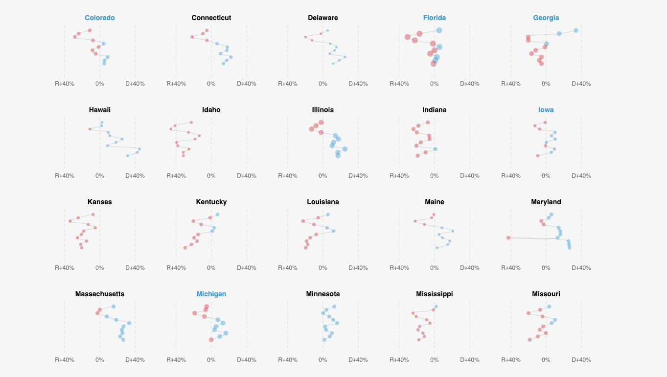
The following chart split the state votes charts into a grid, so that you would be able to see each state individually. I changed the font color for swing states. You’ll notice visually that these states flip parties more frequently and have smaller party variance.
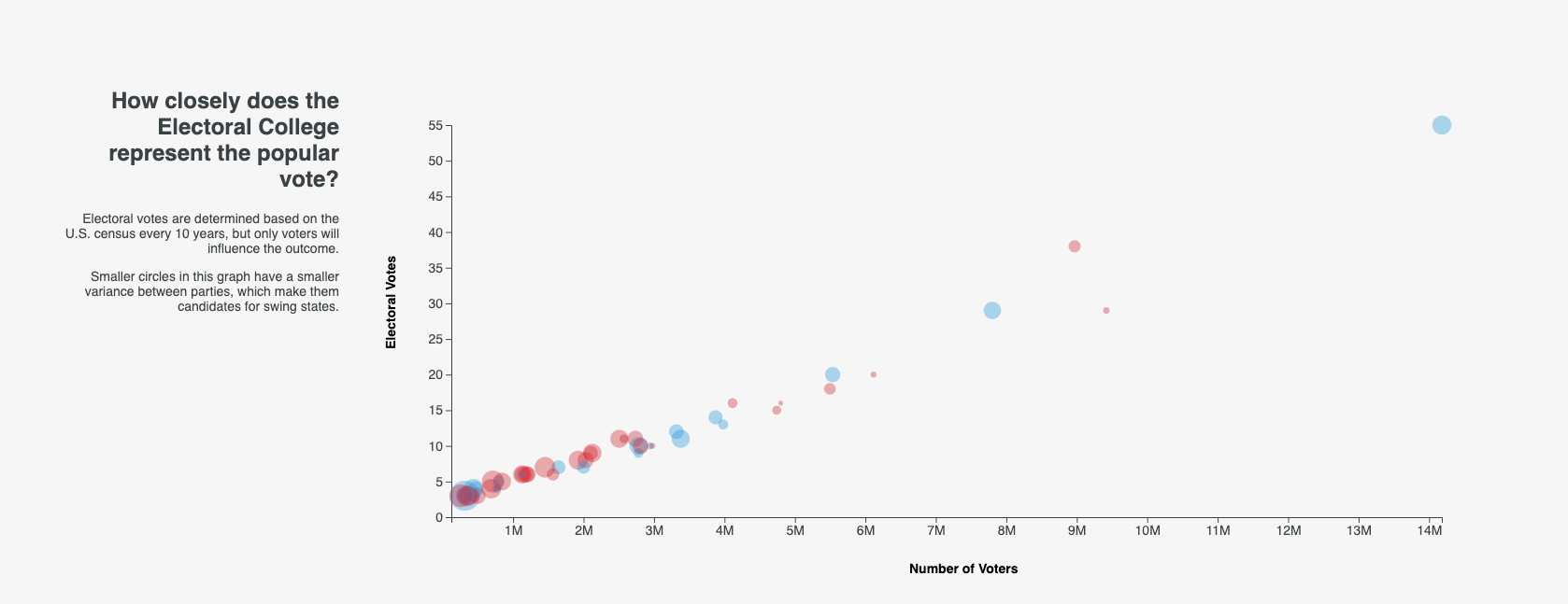
Finally, I made a quick scatterplot that shows a strongly positive correlation between popular vote and electoral votes. If the correlation wasn’t there, we would not be having an electoral college today (or our census is messed up).
Reflection
I really liked this project because I made something simple look clear and good. Unlike my experience with Tableau (a Business Intelligence tool for making quick charts and dashboards), it gets really easy for me to overcomplicate my visuals when I use D3 with the mindset that it is much more customizable.
I wish I can find better data on the U.S. elections, like a breakdown by suburb or zip code, demographics, and historicals, so I can continue using this color palette and extend this design into deeper insights. Maybe you’ll see more in 4 years.